Skyscript Logo Redesign
Skyscript is an astrological platform creating content by astrologers for astrologers
MY ROLE: Art Direction, Design
Creative Director: Deborah Houlding
Challenge
Skyscript’s visual identity was created more than 20 years ago and needed to evolve alongside its audience. The challenge was to modernize the logo and digital experience while preserving the authority and scholarly character the platform had established over time.
Traditional astrology is a complex discipline rooted in historical texts and techniques. The new identity therefore needed to feel approachable to newer students without oversimplifying the subject or alienating the experienced astrologers forming the core of the community.

Solution
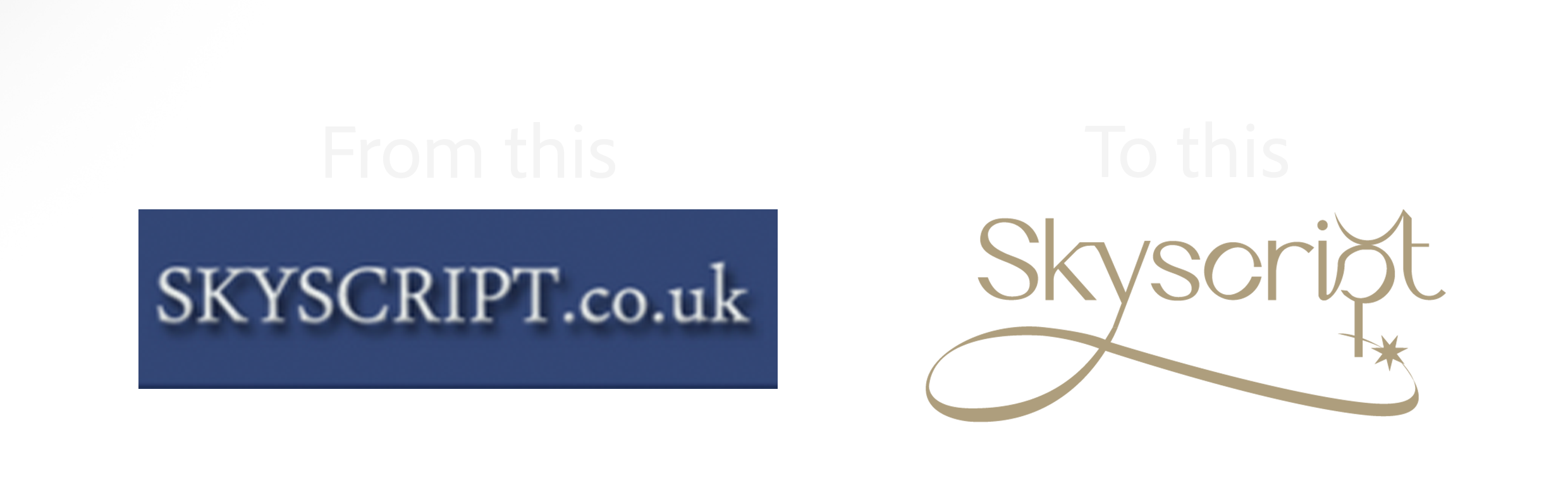
The redesign balances tradition with a clean, contemporary aesthetic.
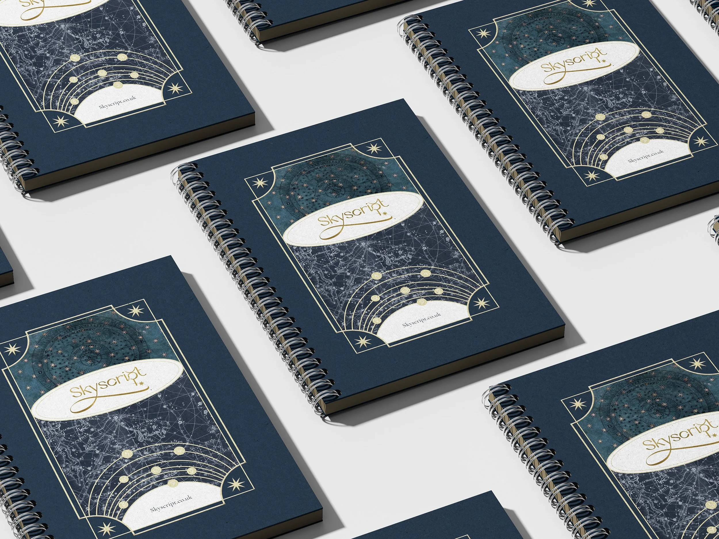
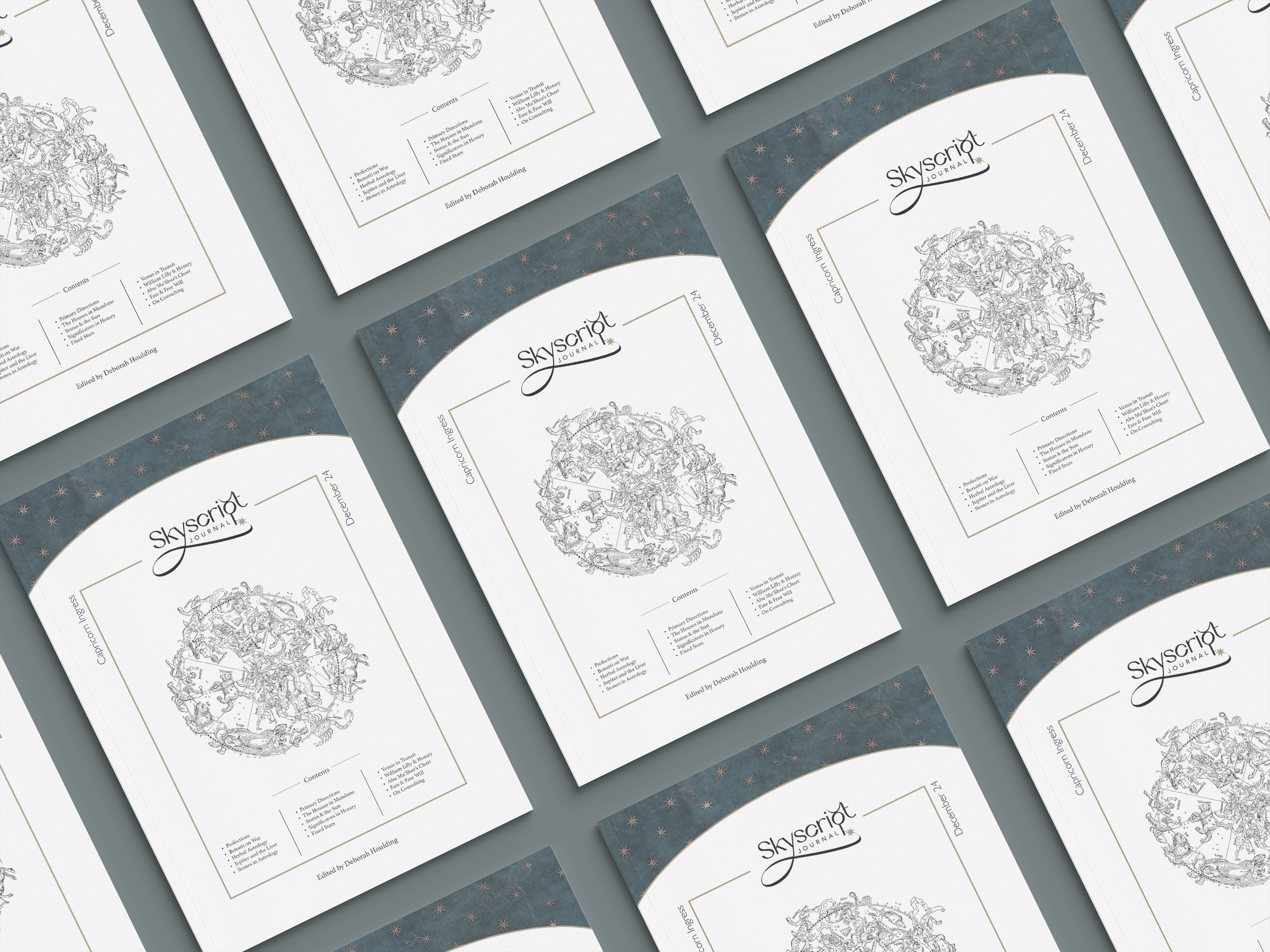
A restrained visual language, sophisticated typography, and uncluttered layouts reinforce Skyscript’s credibility while making its extensive educational content easier to navigate and absorb.


Process
The logo began with a contemporary sans-serif typeface by Riccardo Agostinelli. Its distinctive stroke structure subtly recalls the broad edge of a traditional quill, creating a visual connection between contemporary typography and the historical texts at the heart of traditional astrology.
To give the logo a distinctive astrological signature, the letter p in Skyscript was merged with the traditional symbol for Mercury. Associated with communication, writing, learning, and interpretation, Mercury provided a natural conceptual link between the identity and Skyscript’s role as a platform for astrological knowledge.




There's more!
There's more!